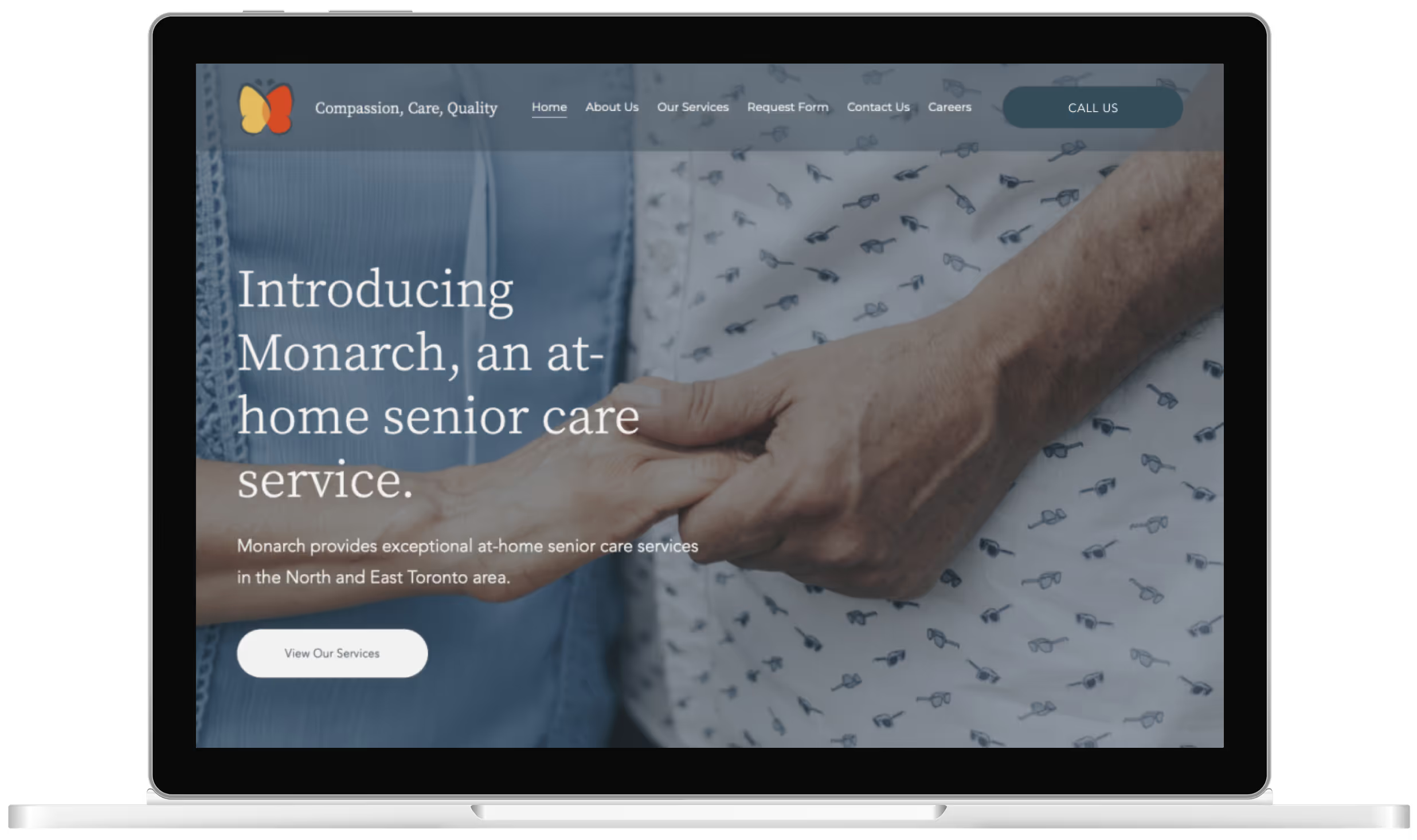


For Monarch Care Services, I concentrated on building a brand identity that demonstrate their commitment to thoughtful care delivered by strongly-qualified teams. Taking inspiration from the company’s namesake, I wanted to illustrate the transformational concept monarch butterflies symbolize and how the Monarch staff supports individuals through their transitional time.
Establishing an impactful digital presence for Monarch involved:
To achieve brand distinctness while maintaining accessibility, I wanted to make direct visual connections to the monarch butterfly through the colour palette and logo.


I focused on integrating subtle visual elements into critical components, such as intuitive intake forms and clear breakdowns of available services, cultivating a seamless online experience for all users.
Another key priority was the creation of a Careers page to support hiring efforts, with the intention of establishing a strong and professional online presence to attract high-caliber staff.


